Exploring WDI PM2.5 air pollution data with the wdiexplorer package.
Source:vignettes/pm_analysis.Rmd
pm_analysis.RmdThis document introduces the wdiexplorer package, and
illustrate how each function can help identify patterns, outliers and
other potentially interesting features of country-level panel data.
The wdiexplorer package provides a collection of indices
and visualisation tools for exploratory analysis of country-level panel
data from the World Development Indicators (WDI, the world bank
collection of development indicators) using the WDI R
package to effectively source and store the data locally. The package
name is an acronym that captures its core functionality: World
Development Indicators Explorer.
There are two main goals of the wdiexplorer package:
A collection of diagnostic indices that characterise panel data behaviour.
Group-informed exploration of country-level panel data that leverage the pre-defined groupings of the data through interactive visuals to capture behavioural patterns and highlight group-based features.
This guide is organised according to these goals, and will continue to evolve with the package.
We further categorised the workflow into three stages, as presented below..
Stage 1: Data Sourcing and Preparation
This initial stage of the workflow uses three core functions:
get_wdi_data; plot_missing; and
get_valid_data.
Data
To load any WDI indicator data of choice, our function
get_wdi_data is designed to retrieve data from the WDI R
package. The get_wdi_data function takes a single argument
named indicator, which should be a valid code (e.g., In
this vignette, we will be using the PM2.5 air pollution data with WDI
indicator code: “EN.ATM.PM25.MC.M3”).
You can find indicator codes by using the
WDI::WDISearch() function in R, as illustrated below.
WDI::WDIsearch("air pollution")use the get_wdi_data() function to fetch the data set from the WDI
pm_data <- get_wdi_data(indicator = "EN.ATM.PM25.MC.M3", verbose = TRUE)
#> Downloading WDI indicator: EN.ATM.PM25.MC.M3
A glimpse of the data
dplyr::glimpse(pm_data)
#> Rows: 14,190
#> Columns: 13
#> $ country           <chr> "Afghanistan", "Afghanistan", "Afghanistan", "Afghan…
#> $ iso2c             <chr> "AF", "AF", "AF", "AF", "AF", "AF", "AF", "AF", "AF"…
#> $ iso3c             <chr> "AFG", "AFG", "AFG", "AFG", "AFG", "AFG", "AFG", "AF…
#> $ year              <int> 1962, 1976, 1975, 1963, 1977, 1968, 1967, 1966, 1965…
#> $ EN.ATM.PM25.MC.M3 <dbl> NA, NA, NA, NA, NA, NA, NA, NA, NA, NA, 63.82661, 64…
#> $ status            <chr> "", "", "", "", "", "", "", "", "", "", "", "", "", …
#> $ lastupdated       <chr> "2026-04-08", "2026-04-08", "2026-04-08", "2026-04-0…
#> $ region            <chr> "South Asia", "South Asia", "South Asia", "South Asi…
#> $ capital           <chr> "Kabul", "Kabul", "Kabul", "Kabul", "Kabul", "Kabul"…
#> $ longitude         <chr> "69.1761", "69.1761", "69.1761", "69.1761", "69.1761…
#> $ latitude          <chr> "34.5228", "34.5228", "34.5228", "34.5228", "34.5228…
#> $ income            <chr> "Low income", "Low income", "Low income", "Low incom…
#> $ lending           <chr> "IDA", "IDA", "IDA", "IDA", "IDA", "IDA", "IDA", "ID…
Identifying Data Gaps
A helpful initial check is to highlight where data is missing across
time and countries. It is essential to summarise the data and identify
countries with missing data. To facilitate this, we extend the
functionality of the vis_miss function from the
naniar package by introducing the plot_missing
function. This function takes two arguments: wdi_data
representing any WDI data object, and group_var a
pre-defined grouping variable within the data set. The resulting grouped
missingness plot arranges countries according to their respective
grouping levels, facilitating a structured overview of missing data.
plot_missing(wdi_data = pm_data, group_var = "region")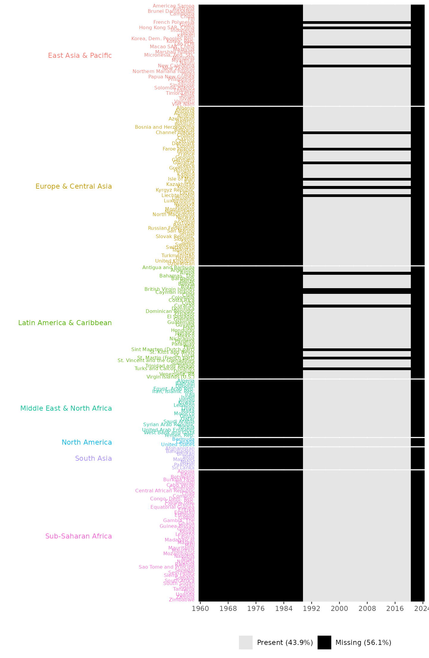
Missingness plot, providing information about the years and countries with missing entries and the overall percentages of missing and present data. It also shows that no data points are available across all countries during the years 1960 to 1989 and 2021 to 2024.
The missingness plot shows that 17 countries across three regions; 4 countries in East Asia & Pacific, 6 countries in Europe & Central Asia, and 7 countries in Latin America & the Caribbean have no valid recorded data between 1990 and 2020. It also shows that no data points are available across all countries during the years 1960 to 1989 and 2021 to 2024.
To complement this visual summary, we introduce a second step: calculating the total number of missing entries per country.
index = "EN.ATM.PM25.MC.M3"

pm_data |>
  dplyr::select(country, region, year, tidyselect::all_of(index)) |>
  dplyr::group_by(region, country) |>
  naniar::miss_var_summary() |>
  dplyr::filter(variable == index) |>
  dplyr::arrange(desc(n_miss))
#> # A tibble: 215 × 5
#> # Groups:   region, country [215]
#>    country                region                    variable     n_miss pct_miss
#>    <chr>                  <chr>                     <chr>         <int>    <num>
#>  1 Aruba                  Latin America & Caribbean EN.ATM.PM25…     66      100
#>  2 British Virgin Islands Latin America & Caribbean EN.ATM.PM25…     66      100
#>  3 Cayman Islands         Latin America & Caribbean EN.ATM.PM25…     66      100
#>  4 Channel Islands        Europe & Central Asia     EN.ATM.PM25…     66      100
#>  5 Curacao                Latin America & Caribbean EN.ATM.PM25…     66      100
#>  6 Faroe Islands          Europe & Central Asia     EN.ATM.PM25…     66      100
#>  7 French Polynesia       East Asia & Pacific       EN.ATM.PM25…     66      100
#>  8 Gibraltar              Europe & Central Asia     EN.ATM.PM25…     66      100
#>  9 Hong Kong SAR, China   East Asia & Pacific       EN.ATM.PM25…     66      100
#> 10 Isle of Man            Europe & Central Asia     EN.ATM.PM25…     66      100
#> # ℹ 205 more rows
In addition, the wdiexplorer package provides the
get_valid_data function, which reports countries with no
data points as well as years for which no data are available, and
returns a tibble with the valid data for the provided WDI indicator data
set.
get_valid_data(pm_data, verbose = TRUE)
#> The 17 countries listed below have no available data and were excluded:
#>  Aruba
#> - British Virgin Islands
#> - Cayman Islands
#> - Channel Islands
#> - Curacao
#> - Faroe Islands
#> - French Polynesia
#> - Gibraltar
#> - Hong Kong SAR, China
#> - Isle of Man
#> - Kosovo
#> - Liechtenstein
#> - Macao SAR, China
#> - New Caledonia
#> - Sint Maarten (Dutch part)
#> - St. Martin (French part)
#> - Turks and Caicos Islands
#>
#> The 35 year(s) listed below had no available data and were excluded:
#>  1960,   1961,   1962,   1963,   1964,   1965,   1966,   1967,   1968,   1969,   1970,   1971,   1972,   1973,   1974,   1975,   1976,   1977,   1978,   1979,   1980,   1981,   1982,   1983,   1984,   1985,   1986,   1987,   1988,   1989,   2021,   2022,   2023,   2024,   2025
#> # A tibble: 6,138 × 13
#>    country iso2c iso3c  year EN.ATM.PM25.MC.M3 status lastupdated region capital
#>    <chr>   <chr> <chr> <int>             <dbl> <chr>  <chr>       <chr>  <chr>
#>  1 Afghan… AF    AFG    1990             64.2  ""     2026-04-08  South… Kabul
#>  2 Albania AL    ALB    1990             23.0  ""     2026-04-08  Europ… Tirane
#>  3 Algeria DZ    DZA    1990             22.4  ""     2026-04-08  Middl… Algiers
#>  4 Americ… AS    ASM    1990              6.43 ""     2026-04-08  East … Pago P…
#>  5 Andorra AD    AND    1990             16.8  ""     2026-04-08  Europ… Andorr…
#>  6 Angola  AO    AGO    1990             23.8  ""     2026-04-08  Sub-S… Luanda
#>  7 Antigu… AG    ATG    1990             19.3  ""     2026-04-08  Latin… Saint …
#>  8 Argent… AR    ARG    1990             19.0  ""     2026-04-08  Latin… Buenos…
#>  9 Armenia AM    ARM    1990             28.2  ""     2026-04-08  Europ… Yerevan
#> 10 Austra… AU    AUS    1990              7.76 ""     2026-04-08  East … Canber…
#> # ℹ 6,128 more rows
#> # ℹ 4 more variables: longitude <chr>, latitude <chr>, income <chr>,
#> #   lending <chr>
Stage 2: Diagnostic Indices
This second stage of the workflow focuses on calculating the diagnostic indices. They measure variation, trend and shape features, as well as sequential temporal characteristics.
Variation features
To measure variation, the compute_variation function
accepts two main arguments: a data set of any WDI indicator and a
grouping variable group_var. It also includes an optional
dissimilarity matrix argument, diss_matrix (defaulting to
the output of compute_dissimilarity. The
compute_dissimilarity function takes a data set of any WDI
indicator, and returns a matrix of dissimilarity values between country
pairs.
Users can compute the dissimilarity matrix separately and pass it
directly as the diss_matrix argument into the
compute_variation function as demonstrated below or allow
the function to compute it internally by specifying only the two main
arguments.
pm_diss_mat <- compute_dissimilarity(pm_data)

pm_variation <- compute_variation(
                    pm_data,
                    diss_matrix = pm_diss_mat,
                    group_var = "region"
        )
The output pm_variation enables the exploration of
computed variation features. It facilitates the identification of the
most distinctive countries, the evaluation of within-group differences,
and the analysis of how closely aligned countries within a group are
compared to those in other groups. However, these measures are not
always intuitive to interpret on their own; they are best understood in
conjunction with the accompanying data series trajectories.
country dissimilarity average
pm_variation |>
        dplyr::arrange(desc(country_avg_dist)) |>
        dplyr::slice_head(n = 3)
#> # A tibble: 3 × 5
#>   country    group              country_avg_dist within_group_avg_dist sil_width
#>   <chr>      <chr>                         <dbl>                 <dbl>     <dbl>
#> 1 Qatar      Middle East & Nor…             344.                  283.    -0.168
#> 2 Niger      Sub-Saharan Africa             330.                  280.    -0.203
#> 3 Mauritania Sub-Saharan Africa             286.                  237.    -0.239
The result above shows that Qatar has the highest overall average dissimilarity, followed by Niger and Mauritania. These countries, Qatar, Niger, and Mauritania, not only rank highest in overall average dissimilarity but also exhibit the highest dissimilarity relative to countries in their respective region groups.
Trend and Shape Features
To examine trend and shape features, the
compute_trend_shape_features takes one main argument: a
dataset of any WDI indicator data and an additional index
argument which defaults to NULL. It returns a data frame
containing columns: country, trend_strength,
linearity, and smoothness.
pm_trend_shape <- compute_trend_shape_features(pm_data)
#> Registered S3 method overwritten by 'tsibble':
#>   method               from
#>   as_tibble.grouped_df dplyr
The pm_trend_shape output enables the exploration of the
computed trend and shape features.
pm_trend_shape |>
        dplyr::arrange(desc(trend_strength)) |>
    dplyr::slice_head(n = 3)
#> # A tibble: 3 × 5
#>   country        trend_strength linearity curvature smoothness
#>   <chr>                   <dbl>     <dbl>     <dbl>      <dbl>
#> 1 Ukraine                 0.996     -32.4     2.69       0.547
#> 2 Moldova                 0.995     -34.4     2.65       0.666
#> 3 United Kingdom          0.995     -16.3    -0.217      0.329
The output highlights countries with the strongest trends. Ukraine, Moldova, and the United Kingdom are the three countries with the strongest trend strength. In this context, trend strength measures the extent to which data follows a consistent pattern over time, whether linear or curved.
Sequential Temporal Features
Lastly, to measure the sequential temporal features of the data
series, the compute_temporal_features also takes the same
arguments as the other functions that calculate diagnostic indices. It
returns a data frame containing columns: country,
crossing_points, flat_spot, and
autocorrelation.
pm_temporal <- compute_temporal_features(pm_data)The pm_temporal output enables the exploration of the
computed sequential temporal features.
pm_temporal |>
   dplyr::arrange(desc(flat_spot)) |>
   dplyr::slice(c(1:3, (dplyr::n() - 2):dplyr::n()))
#> # A tibble: 6 × 4
#>   country              crossing_points flat_spot      acf
#>   <chr>                          <int>     <int>    <dbl>
#> 1 Kyrgyz Republic                    3        18  0.909
#> 2 United Arab Emirates               9        18 -0.00320
#> 3 Armenia                            1        17  0.934
#> 4 Jordan                             3         3  0.846
#> 5 Rwanda                             7         3  0.539
#> 6 West Bank and Gaza                 8         3  0.608
Kyrgyz Republic and United Arab Emirates have the longest flat spots, characterised by long consecutive periods during which their data series remain within an interval. In contrast, Jordan, Rwanda, and West Bank and Gaza exhibit the shortest consecutive periods where their series remain within a specified interval.
We introduce a function that compute all the set of diagnostic
indices collectively and returns the measures in a single data frame.
The compute_diagnostic_indices function takes two
arguments: a dataset of any WDI indicator data and a grouping variable
group_var.
pm_diagnostic_metrics <- compute_diagnostic_indices(pm_data, group_var = "region")This pm_diagnostic_metrics output can be passed directly
to the plot functions of the wdiexplorer package.
Our plot function requires a grouping variable. Hence, we introduce
add_group_info function to append the pre-defined grouping
information from the WDI data set to the data frame of any computed
diagnostics function output. The function takes two arguments: a data
frame with the calculated diagnostic indices
metric_summary; and a dataset of any WDI indicator
data.
pm_diagnostic_metrics_group <- add_group_info(
                    metric_summary = pm_diagnostic_metrics,
                    pm_data
            )
Stage 3: Static and Interactive Visualisations
The third stage of the workflow utilises visual summaries to detect
potentially interesting features within panel data. Our package offers
five core functions, two static plot functions:
plot_metric_distribution,
plot_metric_partition and three interactive plot functions:
plot_data_trajectories, plot_parallel_coords,
and plot_metric_linkview.
plot_metric_distribution
The plot_metric_distribution generates distribution plot
of all set of diagnostic indices or some selected metric(s). By default,
the distribution(s) are ungrouped; if a group_var is
specified, distributions are grouped by its levels within each panel. If
only one metric is specified in metric_var, a single panel
is displayed. The function takes two main arguments: a data frame
containing the computed diagnostic metrics and the pre-defined grouping
information metric_summary; and a variable,
colour_var whose levels are mapped to distinct colours in
the resulting dot plot.
# ungrouped distribution plot
plot_metric_distribution(
      metric_summary = pm_diagnostic_metrics_group,
      colour_var = "region"
      )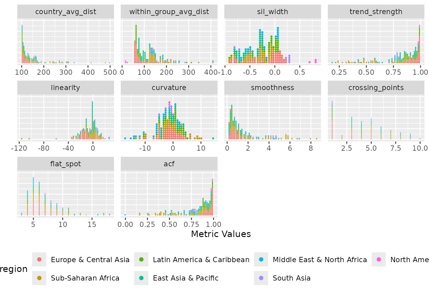
Distribution of diagnostic indices where each panel represents a different metric. It shows the spread of the metric values across countries, with each dot representing a country and coloured by region. Countries in the North America region stand out with the lowest within-group average dissimilarity and the highest silhouette width values.
This Figure shows the ungrouped distribution of all diagnostic indices. Each metric is presented in a separate panel, with each dot per country metric value and dots are coloured by region. The figure reveals distinct distributional patterns across the indices. For instance, country average dissimilarity and smoothness measures are rightly skewed with most countries having low values. This indicates that the majority of countries differ only minimally from one another and tends to follow smooth, gradual changes over time (based on the smoothness measures).
# grouped distribution plot
plot_metric_distribution(
      metric_summary = pm_diagnostic_metrics_group,
      colour_var = "region",
      group_var = "region"
      )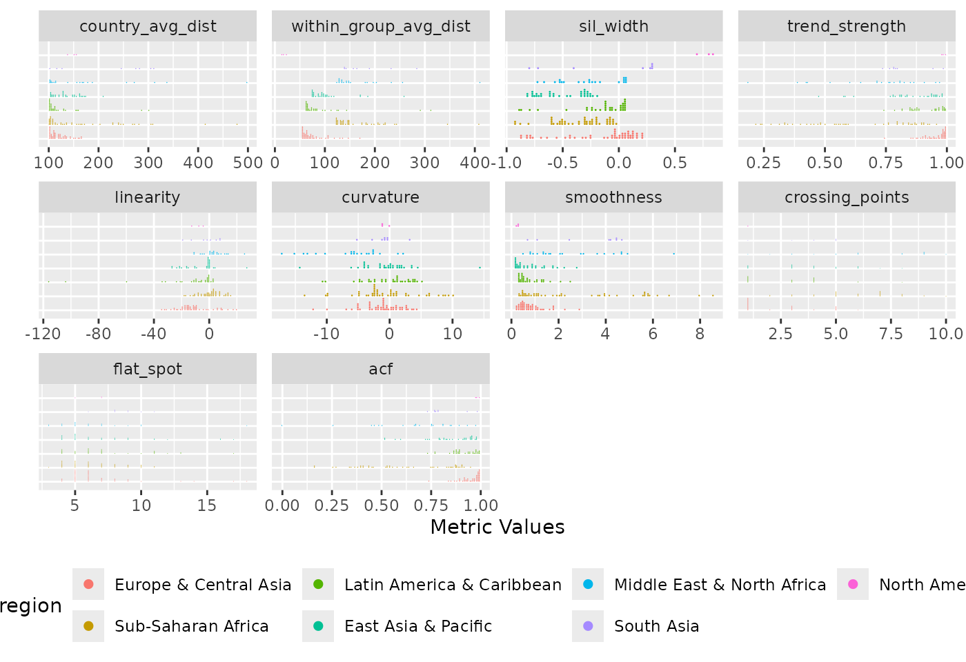
Distribution of diagnostic indices grouped by region. Each panel displays a metric, with countries organised by region to facilitate within and between group comparisons. The plot reveals region-specific patterns and outliers. Sub-Saharan Africa and East Asia & Pacific regions show wider spread while North America region are closely knitted.
The grouped distribution plot shows the distribution of diagnostic indices grouped by region. The ungrouped version presents all countries together as individual dots in a single distribution per metric, the grouped version organises countries by region, making it easier to compare both within and between group metric values across regions. Across all regions, the country average dissimilarity metric is consistently right-skewed, though Sub-Saharan Africa and Middle East & North Africa contain notable outliers that deviate substantially from other countries in their region. A similar pattern is observed in the within-group average dissimilarity metric. In the silhouette width panel, All countries in Latin America & Caribbean and Sub-Saharan Africa have negative values, suggesting that their temporal patterns may be more aligned with countries outside their assigned groups while the three countries in the North America region have the highest silhouette width values.
Users can also generate the distribution plot for specific metric(s) of choice.
# ungrouped distribution plot for linearity metric
plot_metric_distribution(
        metric_summary = pm_diagnostic_metrics_group,
        metric_var = "linearity",
        colour_var = "region"
    )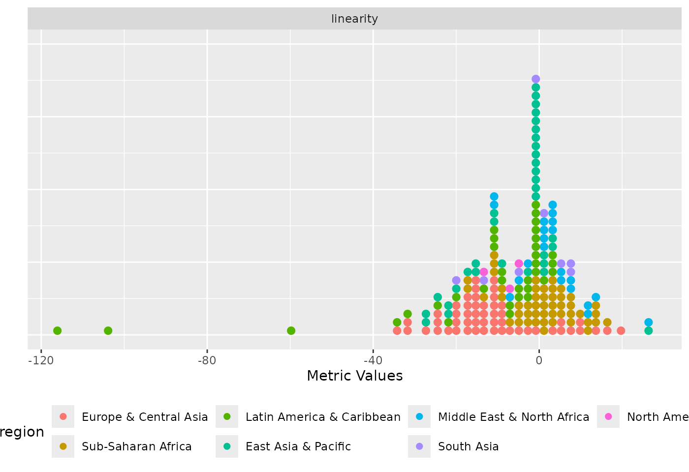
Distribution of the linearity metric coloured by region.
# grouped distribution plot for linearity and curvature metrics
plot_metric_distribution(
        metric_summary = pm_diagnostic_metrics_group,
        metric_var = c("linearity", "curvature"),
        colour_var = "region",
        group_var = "region"
    )
Distribution of the linearity and curvature metrics coloured by region and grouped by region.
plot_metric_partition
The plot_metric_partition function presents metric
values for individual countries grouped by a specified grouping
variable. The metric value of each country is represented by a coloured
bar ordered in descending order, while a lighter-shaded rectangular bar
beneath indicates the group-level average for the metric. The function
takes three arguments: a data frame with the calculated diagnostic
indices and the grouping information, metric_summary; a
variable, metric_var within the data frame that contains
the metric values; and a variable, group_var, with the
grouping information.
plot_metric_partition(
          metric_summary = pm_diagnostic_metrics_group,
          metric_var = "sil_width",
          group_var = "region"
 )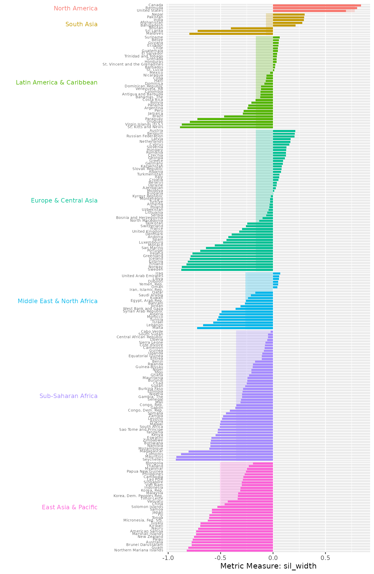
Country silhouette widths, grouped by region, with the average silhouette width for each region underlaid beneath the country bars. Countries in Sub-Saharan Africa and East Asia & Pacific regions all exhibit negative silhouette widths, suggesting that they do not fit well within their assigned regional groupings based on their data series, or that their behaviour may be more similar to countries in other regions.
North America stands out as the region with the most closely aligned data series, with Bermuda, Canada and the United States all exhibiting high positive close to silhouette widths. This indicates that these countries behave consistently in terms of their PM air pollution trends and differ clearly from countries in other regions. In contrast, South Asia displays a mix of both positive and negative silhouette values. Notably, three countries in the region exhibit highly negative values, indicating a weaker fit within the group.
plot_data_trajectories
The plot_data_trajectories function presents the
trajectory of the data series for each country. It supports both the
display of all series uniformly, and also a mode that highlight
countries that fall within a specified percentile of any chosen
diagnostic metric values.
1st mode - data trajectories of all series uniformly
# ungrouped version
plot_data_trajectories(pm_data)
The country line plots of PM2.5 air pollution dataset. Hovering over each line displays the corresponding country name.
# grouped version
plot_data_trajectories(pm_data, group_var = "region")
The PM2.5 air pollution data trajectories faceted by region groupings.
2nd mode - data trajectories with countries highlighted based on a specified metric threshold
# ungrouped version
plot_data_trajectories(
        pm_data,
        metric_summary = pm_diagnostic_metrics,
        metric_var = "country_avg_dist"
    )
The country line plots of PM2.5 air pollution dataset. Countries with average dissimilarity distance values below or at the 95th percentile are displayed in grey, while countries with the top 5% average dissimilarity between itself and other countries are highlighted using a colour gradient. Qatar and Niger, countries displayed in purple-blue exhibit the highest dissimilarity values.
In this Figure, countries highlighted based on the global threshold.
The interactive version of the ungrouped dissimilarity plot available
online via shows that hovering over each highlighted line displays the
country name and the average dissimilarity distance value. This plot
visually complements and reinforces the earlier findings from the
pm_variation output generated by the
compute_variation function.
# grouped version
plot_data_trajectories(
        pm_data,
        metric_summary = pm_diagnostic_metrics_group,
        metric_var = "within_group_avg_dist",
        group_var = "region"
)
The PM2.5 air pollution data trajectories faceted by region groupings with group-based threshold computations rather than a uniform global threshold for highlighting countries with the top percentile. Qatar stood out with the highest dissimilarity values across other countries in Middle East & North Africa while Niger, Mauritania and Senegal are identified as countries with the highest dissimilarity within the Sub-Saharan Africa region.
This Figure shows that within each region, countries are highlighted based on group-specific thresholds. Qatar stands out among all other countries in Middle East & North Africa while Niger and Mauritania stand out in Sub-Saharan Africa. This suggests that their pollution trajectory over time are not only unusual at the global level but also distinct relative to other countries within their group. Air pollution across the African continent was found to be dominated by Saharan dust, with biomass burning identified as a major contributor, particularly in Central and West Africa.
plot_parallel_coords
The plot_parallel_coords function simultaneously
displays all diagnostic metrics, with each metric represented as a
vertical axis. Each country is shown as an interactive line that
intersects all axes, with the position along the x-axis corresponding to
the diagnostic indices. To ensure comparability across metrics, all
values are normalised to a scale of
to
.
The function takes two main arguments: a data frame containing all
diagnostic indices values alongside the pre-defined grouping information
diagnostic_summary and a variable in the data frame
colour_var used to assign colours to the parallel lines. If
an additional optional argument group_var is specified, the
function instead produces a grouped version, where metric values are
normalised within each group before plotting, and the resulting plot is
faceted by the specified grouping variable.
plot_parallel_coords(
      diagnostic_summary = pm_diagnostic_metrics_group,
      colour_var = "region"
)
The static version of the parallel coordinate plot displaying the metric values across all the diagnostic indices. The metric values are normalised to a scale of 0 to 1. Countries in Sub-Saharan Africa region, shown in magenta, display a wide spread across most diagnostics indices.
This Figure displays the parallel coordinates across all 10 diagnostic indices. Hovering over the x-axis, the tooltips show the country name of each parallel line, the correspondence metric, and its metric value. This plot shows that Countries in Sub-Saharan Africa region, display a wide spread across most diagnostics indices.
plot_parallel_coords(
      diagnostic_summary = pm_diagnostic_metrics_group,
      colour_var = "region",
      group_var = "region"
)
The static version of the parallel coordinate plot displaying the metric values across all diagnostic indices grouped by region. The metric values are normalised to a scale of 0 to 1 within each group. Countries in Sub-Saharan Africa region, shown in magenta, display a wide spread across most diagnostics indices.
The ungrouped parallel coordinate plot reveals that countries in North America consistently recorded almost similar values, with slight difference in United States reinforcing earlier findings about the behavioural patterns of PM air pollution levels within this region. They exhibit very low average dissimilarity among themselves, with the United States showing slightly higher values and Canada the lowest, though all remain relatively low as seen in the grouped parallel coordinate plot. Their silhouette widths are all positive and high, further supporting these findings.
United Arab Emirates in the Middle East & North Africa region, is another notable country that stands out in the grouped parallel coordinate plot, primarily due to its distinctive values across several diagnostic metrics. Notably, it records low values for both trend strength and autocorrelation indicating minimal to no consistency in directional movement and weak relationship between successive observations.
Bolivia, a country in the Latin America & Caribbean region, shown in leafgreen also emerges as a notable country that stands out in both ungrouped and grouped parallel coordinate plots, characterised by a unique combination of high trend strength, low linearity, low crossing points, and high autocorrelation.
plot_metric_linkview
The interactive link view of metrics and series plot displays an interactive visualisation that connects diagnostic indices values with their corresponding series trajectories. One panel shows a scatterplot of two selected diagnostic indices (e.g., linearity and curvature), while the other shows the line plot of the data series for each country.
The function takes three main arguments: a dataset containing data
for a selected WDI indicator; a data frame containing the computed
diagnostic indices with the pre-defined grouping information
metric_summary; and a pair of metric variables
metric_var within the metric_summary data
frame used to create a scatterplot. By default, the function generates
an ungrouped interactive link-based visualisation. However, if an
additional optional argument group_var is specified, the
function instead produces a grouped version of the plot faceted by the
specified grouping variable.
# ungrouped version
plot_metric_linkview(
          pm_data,
          metric_summary = pm_diagnostic_metrics,
          metric_var = c("linearity", "curvature")
        )
The static version of the interactive link-based plot showing the relationship between linearity and curvature metrics across all countries. Each point in the scatterplot represents a country, and hovering a point reveals its corresponding data series.
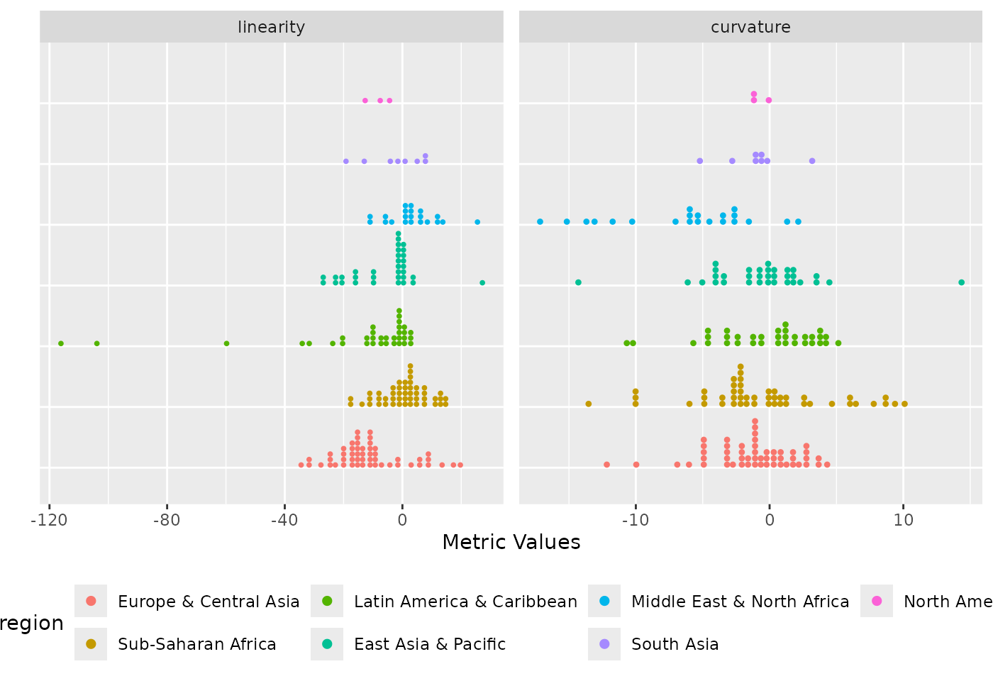
# grouped version
plot_metric_linkview(
          pm_data,
          metric_summary = pm_diagnostic_metrics_group,
          metric_var = c("linearity", "curvature"),
          group_var = "region"
      )
The static version of the grouped link-based plot showing the relationship between linearity and curvature metrics across all countries faceted by region. Each point in the scatterplot represents a country, and hovering a point reveals its corresponding data series in its panel.
In conclusion, incorporating the data pre-defined grouping structure in exploratory analysis of country-level panel data enhances the detection of meaningful patterns, outliers that were hidden when countries are explored either in isolation and as global aggregates, and other interesting temporal behaviours. By accounting for natural groupings such as regions or income categories, the approach provides a detailed characterisation of temporal patterns in the data.