Exploring WDI PISA mathematics data with the wdiexplorer package.
Source:vignettes/pisa_analysis.Rmd
pisa_analysis.RmdThis document introduces the wdiexplorer package, and
illustrate how each function can help identify patterns, outliers and
other potentially interesting features of country-level panel data.
The wdiexplorer package provides a collection of indices
and visualisation tools for exploratory analysis of country-level panel
data from the World Development Indicators (WDI, the world bank
collection of development indicators) using the WDI R
package to effectively source and store the data locally. The package
name is an acronym that captures its core functionality: World
Development Indicators Explorer.
There are two main goals of the wdiexplorer package:
A collection of diagnostic indices that characterise panel data behaviour.
Group-informed exploration of country-level panel data that leverage the pre-defined groupings of the data through interactive visuals to capture behavioural patterns and highlight group-based features.
This guide is organised according to these goals, and will continue to evolve with the package.
We further categorised the workflow into three stages, as presented below.
Stage 1: Data Sourcing and Preparation
This initial stage of the workflow uses three core functions:
get_wdi_data; plot_missing; and
get_valid_data.
Data
To load any WDI indicator data of choice, our function
get_wdi_data is designed to retrieve data from the WDI R
package. The get_wdi_data function takes a single argument
named indicator, which should be a valid code (e.g., In
this vignette, we will be using the mathematics scores of the Programme
for International Student Assessment (PISA), a study conducted by the
Organisation for Economic Co-operation and Development (OECD) that
evaluates education systems by measuring 15-year-old students’
performance in reading, mathematics, and science every three years. The
WDI indicator code for PISA mathematics score is “LO.PISA.MAT”).
You can find indicator codes by using the
WDI::WDISearch() function in R, as illustrated below.
pisa_data <- get_wdi_data(indicator = "LO.PISA.MAT", verbose = TRUE)
#> Downloading WDI indicator: LO.PISA.MAT
A glimpse of the data
dplyr::glimpse(pisa_data)
#> Rows: 15,624
#> Columns: 13
#> $ country     <chr> "Afghanistan", "Afghanistan", "Afghanistan", "Afghanistan"…
#> $ iso2c       <chr> "AF", "AF", "AF", "AF", "AF", "AF", "AF", "AF", "AF", "AF"…
#> $ iso3c       <chr> "AFG", "AFG", "AFG", "AFG", "AFG", "AFG", "AFG", "AFG", "A…
#> $ year        <int> 2031, 2030, 2029, 2028, 2027, 2026, 2025, 2024, 2023, 2022…
#> $ LO.PISA.MAT <dbl> NA, NA, NA, NA, NA, NA, NA, NA, NA, NA, NA, NA, NA, NA, NA…
#> $ status      <chr> "", "", "", "", "", "", "", "", "", "", "", "", "", "", ""…
#> $ lastupdated <chr> "2024-06-25", "2024-06-25", "2024-06-25", "2024-06-25", "2…
#> $ region      <chr> "South Asia", "South Asia", "South Asia", "South Asia", "S…
#> $ capital     <chr> "Kabul", "Kabul", "Kabul", "Kabul", "Kabul", "Kabul", "Kab…
#> $ longitude   <chr> "69.1761", "69.1761", "69.1761", "69.1761", "69.1761", "69…
#> $ latitude    <chr> "34.5228", "34.5228", "34.5228", "34.5228", "34.5228", "34…
#> $ income      <chr> "Low income", "Low income", "Low income", "Low income", "L…
#> $ lending     <chr> "IDA", "IDA", "IDA", "IDA", "IDA", "IDA", "IDA", "IDA", "I…
Identifying Data Gaps
A helpful initial check is to highlight where data is missing across
time and countries. It is essential to summarise the data and identify
countries with missing data. To facilitate this, we extend the
functionality of the vis_miss function from the
naniar package by introducing the plot_missing
function. This function takes two arguments: wdi_data
representing any WDI data object, and group_var a
pre-defined grouping variable within the data set. The resulting grouped
missingness plot arranges countries according to their respective
grouping levels, facilitating a structured overview of missing data.
plot_missing(wdi_data = pisa_data, group_var = "income")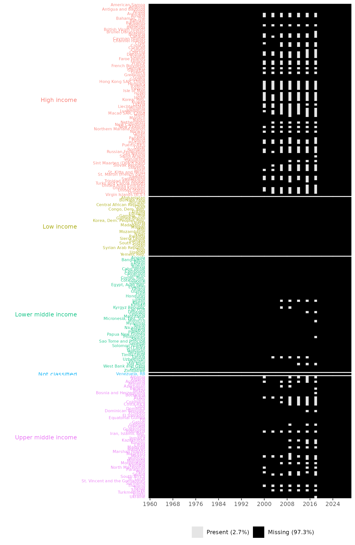
Missingness plot, providing information about years and countries with missing entries and the overall percentages of missing and present data. It also shows that no data points are available across all countries during the years 1960 to 1999 and 2019 to 2024. It also shows that data are collected triennially.
The missingness plot shows that no data are available from 1960 to 1999, 2019 to 2024 and that the available data are collected triennially. This indicates that OECD data collection began in 2000. In total, 133 countries have no valid recorded data. The plot also reveals that there are no available data for Low income group.
To complement this visual summary, we introduce a second step: calculating the total number of missing entries per country.
index = "LO.PISA.MAT"

pisa_data |>
  dplyr::select(country, income, year, tidyselect::all_of(index)) |>
  dplyr::group_by(income, country) |>
  naniar::miss_var_summary() |>
  dplyr::filter(variable == index) |>
  dplyr::arrange(desc(n_miss))
#> # A tibble: 217 × 5
#> # Groups:   income, country [217]
#>    country             income              variable    n_miss pct_miss
#>    <chr>               <chr>               <chr>        <int>    <num>
#>  1 Afghanistan         Low income          LO.PISA.MAT     72      100
#>  2 American Samoa      High income         LO.PISA.MAT     72      100
#>  3 Andorra             High income         LO.PISA.MAT     72      100
#>  4 Angola              Lower middle income LO.PISA.MAT     72      100
#>  5 Antigua and Barbuda High income         LO.PISA.MAT     72      100
#>  6 Armenia             Upper middle income LO.PISA.MAT     72      100
#>  7 Aruba               High income         LO.PISA.MAT     72      100
#>  8 Bahamas, The        High income         LO.PISA.MAT     72      100
#>  9 Bahrain             High income         LO.PISA.MAT     72      100
#> 10 Bangladesh          Lower middle income LO.PISA.MAT     72      100
#> # ℹ 207 more rows
In addition, the wdiexplorer package provides the
get_valid_data function, which reports countries with no
data points as well as years for which no data are available, and
returns a tibble with the valid data for the provided WDI indicator data
set.
get_valid_data(pisa_data, verbose = TRUE)
#> The 133 countries listed below have no available data and were excluded:
#>  Afghanistan
#> - American Samoa
#> - Andorra
#> - Angola
#> - Antigua and Barbuda
#> - Armenia
#> - Aruba
#> - Bahamas, The
#> - Bahrain
#> - Bangladesh
#> - Barbados
#> - Belize
#> - Benin
#> - Bermuda
#> - Bhutan
#> - Bolivia
#> - Botswana
#> - British Virgin Islands
#> - Burkina Faso
#> - Burundi
#> - Cabo Verde
#> - Cambodia
#> - Cameroon
#> - Cayman Islands
#> - Central African Republic
#> - Chad
#> - Channel Islands
#> - Comoros
#> - Congo, Dem. Rep.
#> - Congo, Rep.
#> - Cote dIvoire
#> - Cuba
#> - Curacao
#> - Djibouti
#> - Dominica
#> - Ecuador
#> - Egypt, Arab Rep.
#> - El Salvador
#> - Equatorial Guinea
#> - Eritrea
#> - Eswatini
#> - Ethiopia
#> - Faroe Islands
#> - Fiji
#> - French Polynesia
#> - Gabon
#> - Gambia, The
#> - Ghana
#> - Gibraltar
#> - Greenland
#> - Grenada
#> - Guam
#> - Guatemala
#> - Guinea
#> - Guinea-Bissau
#> - Guyana
#> - Haiti
#> - Honduras
#> - India
#> - Iran, Islamic Rep.
#> - Iraq
#> - Isle of Man
#> - Jamaica
#> - Kenya
#> - Kiribati
#> - Korea, Dem. Peoples Rep.
#> - Kuwait
#> - Lao PDR
#> - Lesotho
#> - Liberia
#> - Libya
#> - Madagascar
#> - Malawi
#> - Maldives
#> - Mali
#> - Marshall Islands
#> - Mauritania
#> - Micronesia, Fed. Sts.
#> - Monaco
#> - Mongolia
#> - Mozambique
#> - Myanmar
#> - Namibia
#> - Nauru
#> - Nepal
#> - New Caledonia
#> - Nicaragua
#> - Niger
#> - Nigeria
#> - Northern Mariana Islands
#> - Oman
#> - Pakistan
#> - Palau
#> - Papua New Guinea
#> - Paraguay
#> - Puerto Rico
#> - Rwanda
#> - Samoa
#> - San Marino
#> - Sao Tome and Principe
#> - Senegal
#> - Seychelles
#> - Sierra Leone
#> - Sint Maarten (Dutch part)
#> - Solomon Islands
#> - Somalia
#> - South Africa
#> - South Sudan
#> - Sri Lanka
#> - St. Kitts and Nevis
#> - St. Lucia
#> - St. Martin (French part)
#> - St. Vincent and the Grenadines
#> - Sudan
#> - Suriname
#> - Syrian Arab Republic
#> - Tajikistan
#> - Tanzania
#> - Timor-Leste
#> - Togo
#> - Tonga
#> - Turkmenistan
#> - Turks and Caicos Islands
#> - Tuvalu
#> - Uganda
#> - Uzbekistan
#> - Vanuatu
#> - Venezuela, RB
#> - Virgin Islands (U.S.)
#> - West Bank and Gaza
#> - Yemen, Rep.
#> - Zambia
#> - Zimbabwe
#>
#>  The 9 countries listed below have one available data point and were excluded:
#>  Algeria
#> - Belarus
#> - Bosnia and Herzegovina
#> - Brunei Darussalam
#> - Mauritius
#> - Morocco
#> - Philippines
#> - Saudi Arabia
#> - Ukraine
#>
#> The 65 year(s) listed below had no available data and were excluded:
#>  1960,   1961,   1962,   1963,   1964,   1965,   1966,   1967,   1968,   1969,   1970,   1971,   1972,   1973,   1974,   1975,   1976,   1977,   1978,   1979,   1980,   1981,   1982,   1983,   1984,   1985,   1986,   1987,   1988,   1989,   1990,   1991,   1992,   1993,   1994,   1995,   1996,   1997,   1998,   1999,   2001,   2002,   2004,   2005,   2007,   2008,   2010,   2011,   2013,   2014,   2016,   2017,   2019,   2020,   2021,   2022,   2023,   2024,   2025,   2026,   2027,   2028,   2029,   2030,   2031
#> # A tibble: 525 × 13
#>    country    iso2c iso3c  year LO.PISA.MAT status lastupdated region    capital
#>    <chr>      <chr> <chr> <int>       <dbl> <chr>  <chr>       <chr>     <chr>
#>  1 Albania    AL    ALB    2000        381  ""     2024-06-25  Europe &… Tirane
#>  2 Argentina  AR    ARG    2000        388  ""     2024-06-25  Latin Am… Buenos…
#>  3 Australia  AU    AUS    2000        533  ""     2024-06-25  East Asi… Canber…
#>  4 Austria    AT    AUT    2000        502. ""     2024-06-25  Europe &… Vienna
#>  5 Azerbaijan AZ    AZE    2000         NA  ""     2024-06-25  Europe &… Baku
#>  6 Belgium    BE    BEL    2000        520  ""     2024-06-25  Europe &… Brusse…
#>  7 Brazil     BR    BRA    2000        334  ""     2024-06-25  Latin Am… Brasil…
#>  8 Bulgaria   BG    BGR    2000        430  ""     2024-06-25  Europe &… Sofia
#>  9 Canada     CA    CAN    2000        533  ""     2024-06-25  North Am… Ottawa
#> 10 Chile      CL    CHL    2000        384  ""     2024-06-25  Latin Am… Santia…
#> # ℹ 515 more rows
#> # ℹ 4 more variables: longitude <chr>, latitude <chr>, income <chr>,
#> #   lending <chr>
The get_valid_data function reports the 133 countries
without valid data, the 9 other countries with only one valid data point
and the 64 years with no available data. These entries were excluded
from the exploratory analysis.
Stage 2: Diagnostic Indices
This second stage of the workflow focuses on calculating the diagnostic indices. They measure variation, trend and shape features, as well as sequential temporal characteristics.
Variation features
To measure variation, the compute_variation function
accepts two main arguments: a data set of any WDI indicator and a
grouping variable group_var. It also includes an optional
dissimilarity matrix argument, diss_matrix (defaulting to
the output of compute_dissimilarity. The
compute_dissimilarity function takes a data set of any WDI
indicator, and returns a matrix of dissimilarity values between country
pairs.
Users can compute the dissimilarity matrix separately and pass it
directly as the diss_matrix argument into the
compute_variation function as demonstrated below or allow
the function to compute it internally by specifying only the two main
arguments.
pisa_diss_mat <- compute_dissimilarity(pisa_data)

pisa_variation <- compute_variation(
                    pisa_data,
                    diss_matrix = pisa_diss_mat,
                    group_var = "income"
        )
The output pisa_variation enables the exploration of
computed variation features. It facilitates the identification of the
most distinctive countries, the evaluation of within-group differences,
and the analysis of how closely aligned countries within a group are
compared to those in other groups. However, these measures are not
always intuitive to interpret on their own; they are best understood in
conjunction with the accompanying data series trajectories.
country dissimilarity average
pisa_variation |>
        dplyr::arrange(desc(country_avg_dist)) |>
        dplyr::slice_head(n = 3)
#> # A tibble: 3 × 5
#>   country            group      country_avg_dist within_group_avg_dist sil_width
#>   <chr>              <chr>                 <dbl>                 <dbl>     <dbl>
#> 1 Kyrgyz Republic    Lower mid…             374.                  150.    0.349
#> 2 Dominican Republic Upper mid…             360.                  240.   -0.0611
#> 3 China              Upper mid…             343.                  483.   -0.440
The result above shows that Kyrgyz Republic has the highest overall average dissimilarity, followed by China and Dominican Republic.
Trend and Shape Features
To examine trend and shape features, the
compute_trend_shape_features takes one main argument: a
dataset of any WDI indicator data and an additional index
argument which defaults to NULL. It returns a data frame
containing columns: country, trend_strength,
linearity, and smoothness.
pisa_trend_shape <- compute_trend_shape_features(pisa_data)
#> Note: The dataset 'pisa_data' has missing values.
#>  Missing entries are replaced by linear interpolation.
#> Registered S3 method overwritten by 'tsibble':
#>   method               from
#>   as_tibble.grouped_df dplyr
The pisa_trend_shape output enables the exploration of
the computed trend and shape features. Countries with NA metric values
are countries with two non-consecutive data points.
pisa_trend_shape |>
        dplyr::arrange(desc(trend_strength)) |>
    dplyr::slice_head(n = 3)
#> # A tibble: 3 × 5
#>   country   trend_strength linearity curvature smoothness
#>   <chr>              <dbl>     <dbl>     <dbl>      <dbl>
#> 1 Australia          0.984     -38.3    -0.449       1.08
#> 2 Peru               0.979      92.0    -3.85        2.62
#> 3 Canada             0.957     -20.2    -0.398       1.08
The output highlights countries with the strongest trends. Australia, Peru, and Canada are the three countries with the strongest trend strength. In this context, trend strength measures the extent to which data follows a consistent pattern over time, whether linear or curved.
Sequential Temporal Features
Lastly, to measure the sequential temporal features of the data
series, the compute_temporal_features also takes the same
arguments as the other functions that calculate diagnostic indices. It
returns a data frame containing columns: country,
crossing_points, flat_spot, and
autocorrelation.
pisa_temporal <- compute_temporal_features(pisa_data)The pisa_temporal output enables the exploration of the
computed sequential temporal features.
pisa_temporal |>
   dplyr::arrange(desc(flat_spot)) |>
   dplyr::slice(c(1:3, (dplyr::n() - 2):dplyr::n()))
#> # A tibble: 6 × 4
#>   country              crossing_points flat_spot      acf
#>   <chr>                          <int>     <int>    <dbl>
#> 1 Luxembourg                         4         4 -0.578
#> 2 United Kingdom                     2         4  0.746
#> 3 Chile                              2         3 -0.102
#> 4 Turkiye                            3         1 -0.332
#> 5 United Arab Emirates               1         1 NA
#> 6 United States                      3         1  0.00885
Luxembourg and United Kingdom have the longest flat spots, characterised by long consecutive periods during which their data series remain within an interval. In contrast, Turkiye, United Arab Emirates, and United States exhibit the shortest consecutive period (1) where their series remain within a specified interval.
We introduce a function that compute all the set of diagnostic
indices collectively and returns the measures in a single data frame.
The compute_diagnostic_indices function takes two
arguments: a dataset of any WDI indicator data and a grouping variable
group_var.
pisa_diagnostic_metrics <- compute_diagnostic_indices(pisa_data, group_var = "income")
#> Note: The dataset 'wdi_data' has missing values.
#>  Missing entries are replaced by linear interpolation.
This pisa_diagnostic_metrics output can be passed
directly to the plot functions of the wdiexplorer
package.
Our plot function requires a grouping variable. Hence, we introduce
add_group_info function to append the pre-defined grouping
information from the WDI data set to the data frame of any computed
diagnostics function output. The function takes two arguments: a data
frame with the calculated diagnostic indices
metric_summary; and a dataset of any WDI indicator
data.
pisa_diagnostic_metrics_group <- add_group_info(
                    metric_summary = pisa_diagnostic_metrics,
                    pisa_data
            )
Stage 3: Static and Interactive Visualisations
The third stage of the workflow utilises visual summaries to detect
potentially interesting features within panel data. Our package offers
five core functions, two static plot functions:
plot_metric_distribution,
plot_metric_partition and three interactive plot functions:
plot_data_trajectories, plot_parallel_coords,
and plot_metric_linkview.
plot_metric_distribution
The plot_metric_distribution generates distribution plot
of all set of diagnostic indices or some selected metric(s). By default,
the distribution(s) are ungrouped; if a group_var is
specified, distributions are grouped by its levels within each panel. If
only one metric is specified in metric_var, a single panel
is displayed. The function takes two main arguments: a data frame
containing the computed diagnostic metrics and the pre-defined grouping
information metric_summary; and a variable,
colour_var whose levels are mapped to distinct colours in
the resulting dot plot.
# ungrouped distribution plot
plot_metric_distribution(
      metric_summary = pisa_diagnostic_metrics_group,
      colour_var = "income"
      )
#> Warning: Removed 13 rows containing missing values or values outside the scale range
#> (`geom_dotsinterval()`).
#> Removed 13 rows containing missing values or values outside the scale range
#> (`geom_dotsinterval()`).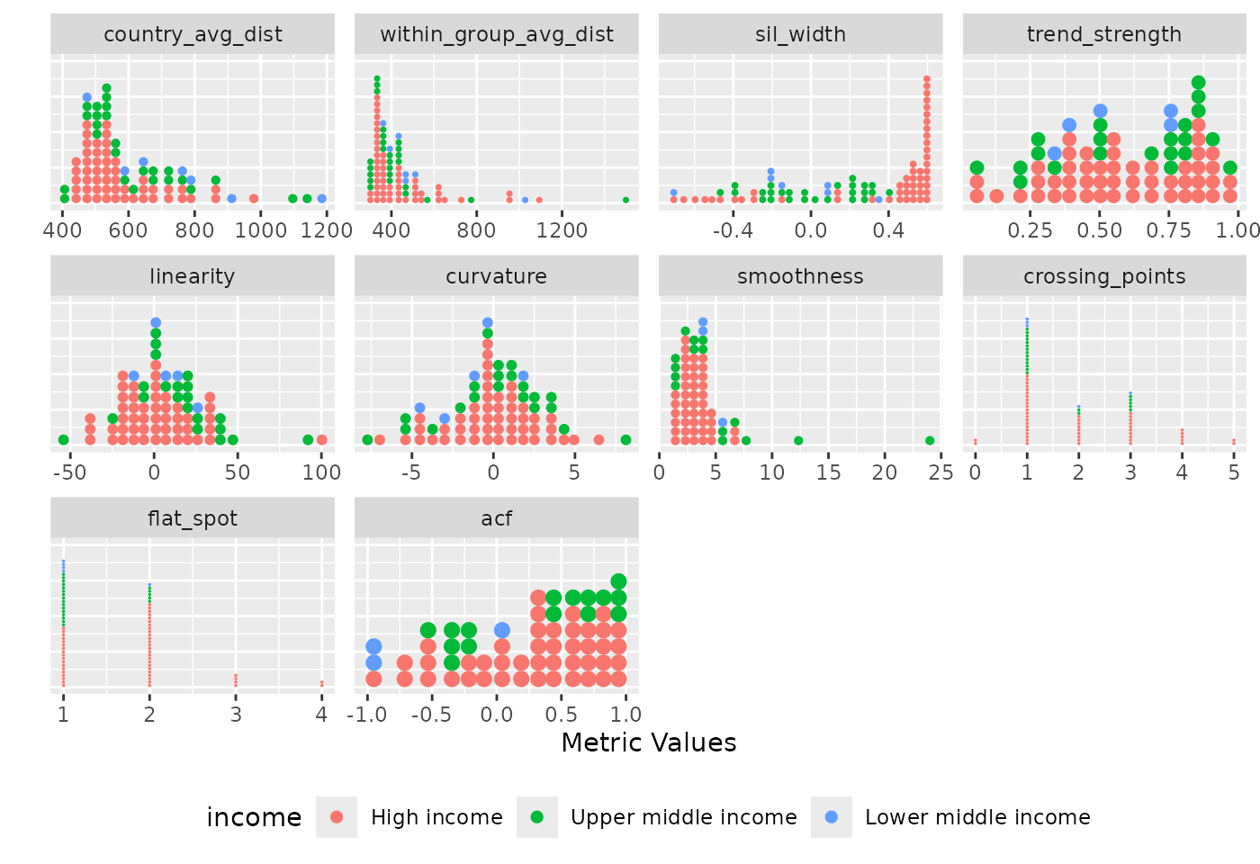
Distribution of diagnostic indices where each panel represents a different metric. It shows the spread of the metric values across countries, with each dot representing a country and coloured by income.
This Figure shows the ungrouped distribution of all diagnostic indices. Each metric is presented in a separate panel, with each dot per country metric value and dots are coloured by income. The figure reveals distinct distributional patterns across the indices. For instance, country average dissimilarity, within group average dissimilarity, and smoothness measures are rightly skewed with most countries having low values. This indicates that the majority of countries differ only minimally from one another and tends to follow smooth, gradual changes over time (based on the smoothness measures).
# grouped distribution plot
plot_metric_distribution(
      metric_summary = pisa_diagnostic_metrics_group,
      colour_var = "income",
      group_var = "income"
      )
#> Warning: Removed 13 rows containing missing values or values outside the scale range
#> (`geom_dotsinterval()`).
#> Removed 13 rows containing missing values or values outside the scale range
#> (`geom_dotsinterval()`).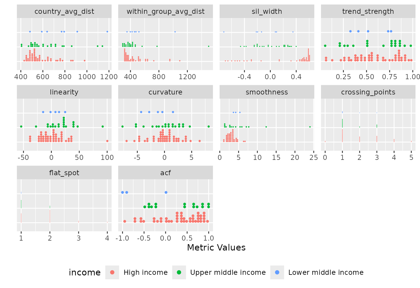
Distribution of diagnostic indices grouped by income. Each panel displays a metric, with countries organised by income to facilitate within and between group comparisons. The plot reveals income-specific patterns and outliers. High income and low income groups show wider spread across all metrics.
The grouped distribution plot shows the distribution of diagnostic indices grouped by income. The ungrouped version presents all countries together as individual dots in a single distribution per metric, the grouped version organises countries by income, making it easier to compare both within and between group metric values across incomes. Across all incomes, the country average dissimilarity metric is consistently right-skewed, though upper middle income and lower middle income group contain notable outliers that deviate substantially from other countries in their group. A similar pattern is observed in the within-group average dissimilarity metric. In the silhouette width panel, the majority of countries appear to have positive silhouette widths, especially in the high income group with only a few exhibiting negative values. This suggest that the temporal patterns of countries with negative silhouette width may be more aligned with countries outside their assigned groups. Likewise, across the smoothness metric, majority of the countries have low smoothness values with an outlier in upper middle income.
Users can also generate the distribution plot for specific metric(s) of choice.
# ungrouped distribution plot for trend-strength metric
plot_metric_distribution(
        metric_summary = pisa_diagnostic_metrics_group,
        metric_var = "trend_strength",
        colour_var = "income"
    )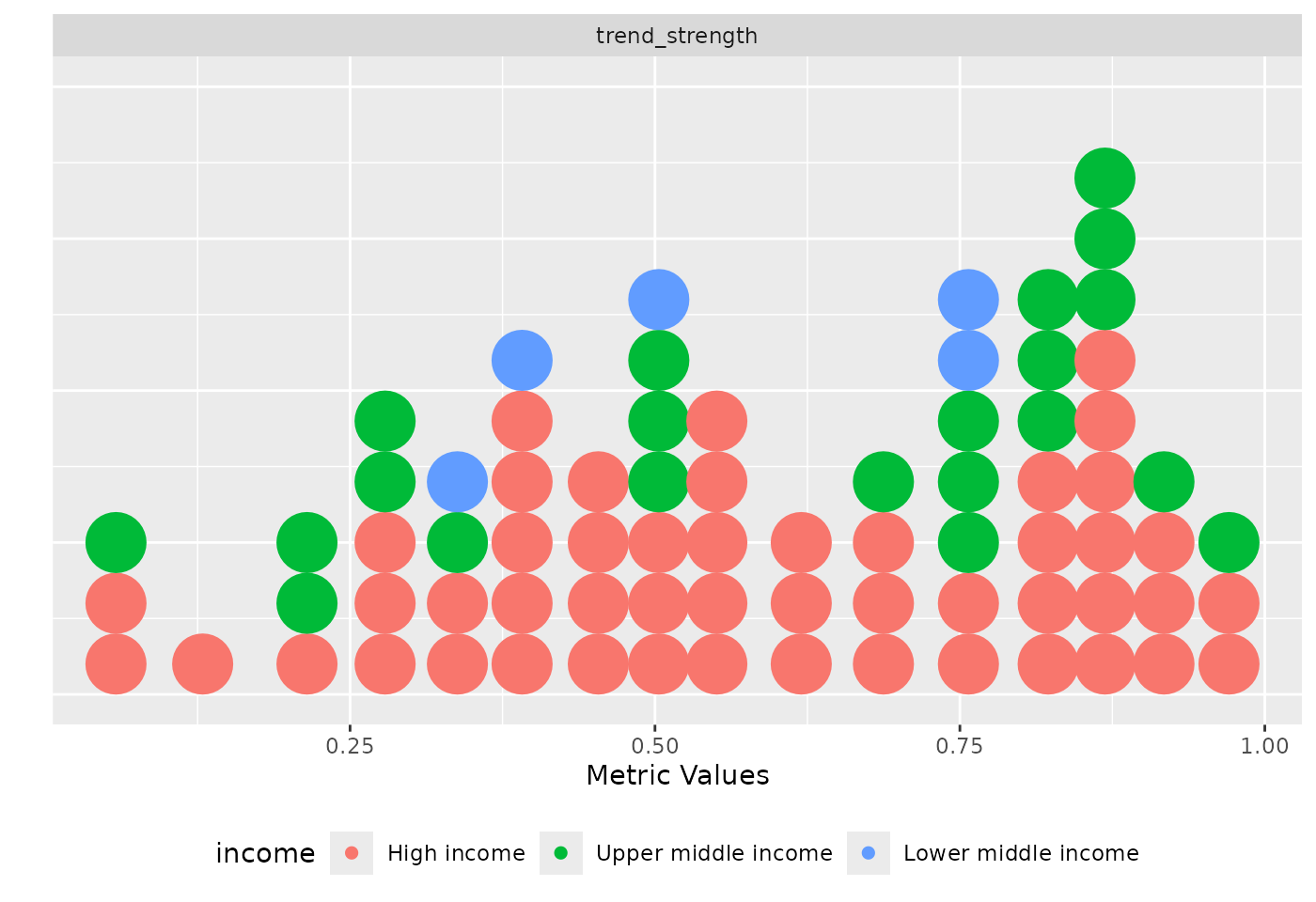
Distribution of the trend strength metric coloured by income.
# grouped distribution plot for linearity and curvature metrics
plot_metric_distribution(
        metric_summary = pisa_diagnostic_metrics_group,
        metric_var = c("linearity", "curvature"),
        colour_var = "income",
        group_var = "income"
    )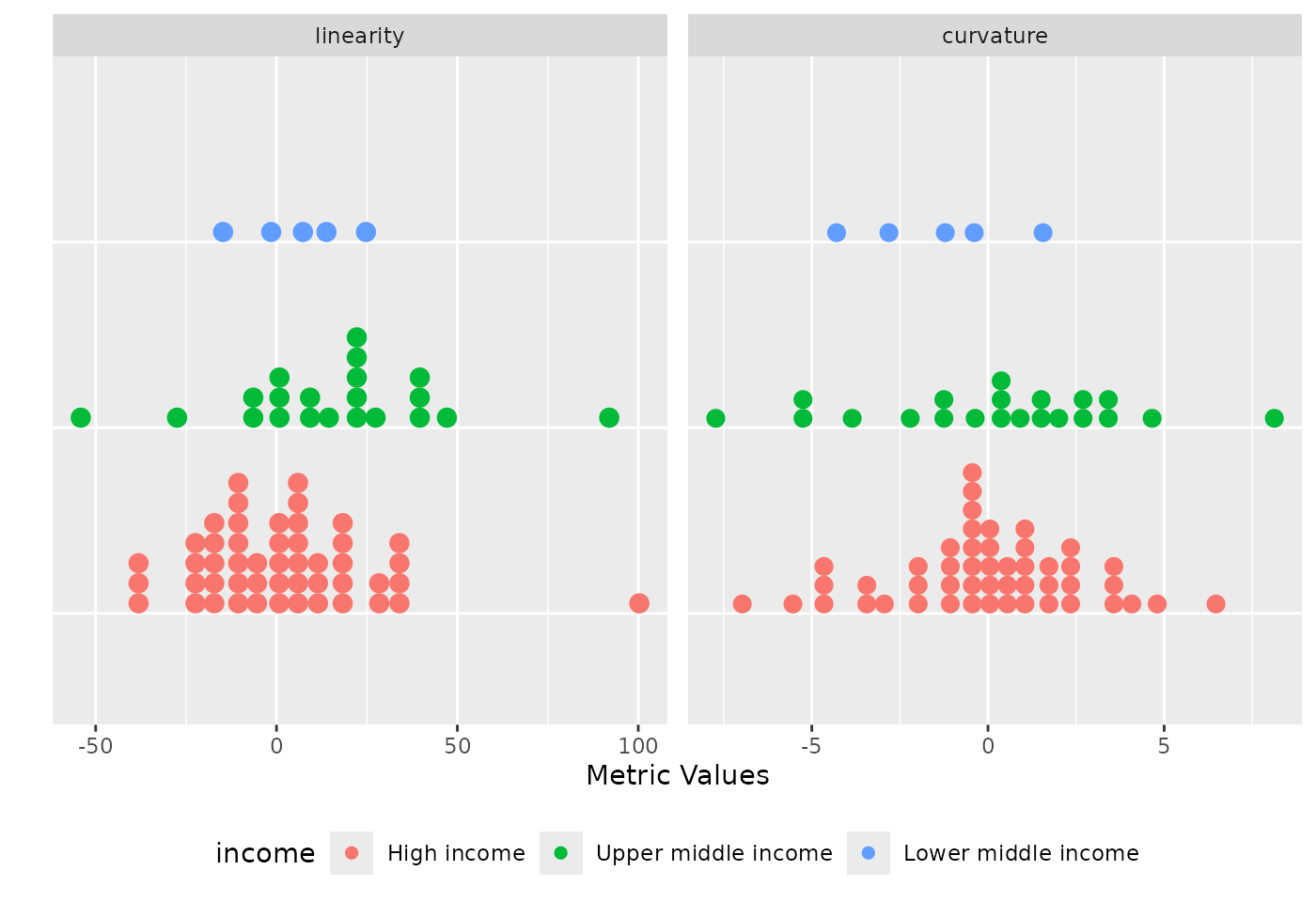
Distribution of the linearity and curvature metrics coloured by income and grouped by income.
plot_metric_partition
The plot_metric_partition function presents metric
values for individual countries grouped by a specified grouping
variable. The metric value of each country is represented by a coloured
bar ordered in descending order, while a lighter-shaded rectangular bar
beneath indicates the group-level average for the metric. The function
takes three arguments: a data frame with the calculated diagnostic
indices and the grouping information, metric_summary; a
variable, metric_var within the data frame that contains
the metric values; and a variable, group_var, with the
grouping information.
plot_metric_partition(
          metric_summary = pisa_diagnostic_metrics_group,
          metric_var = "sil_width",
          group_var = "income"
 )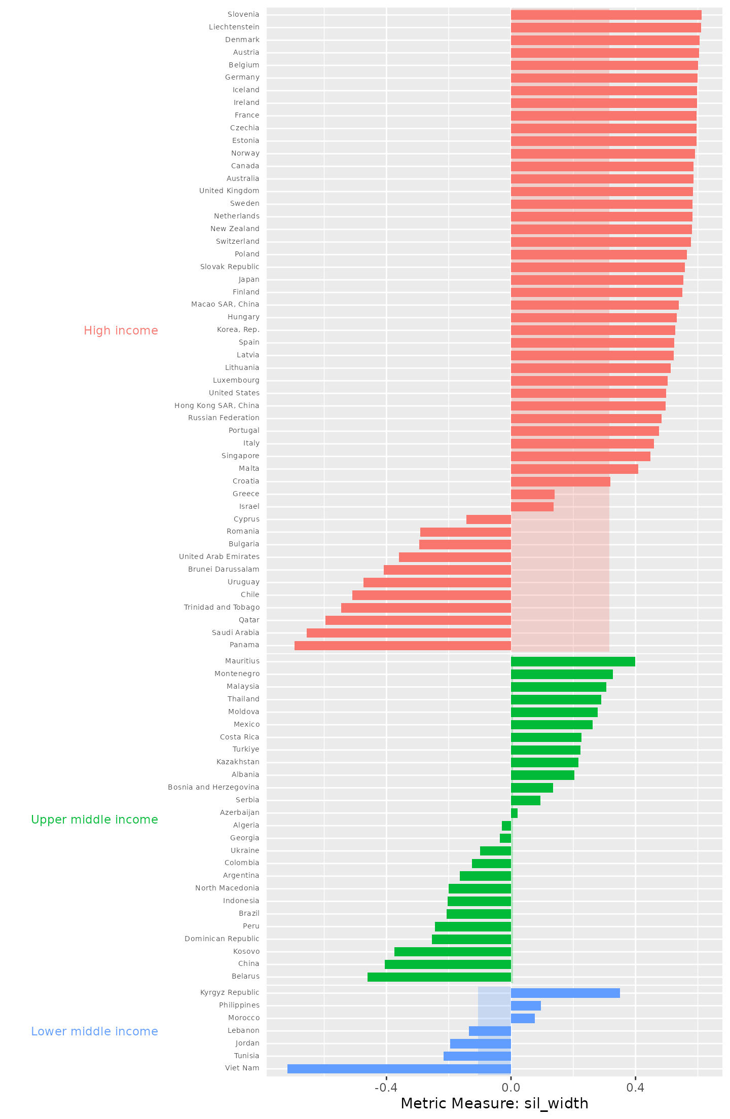
Country silhouette widths, grouped by income, with the average silhouette width for each income underlaid beneath the country bars. The majority of the countries in high income group exhibit positive silhouette widths. Across all the groups, they exhibit both positive and negative silhouette widths.
In the low middle income group, only Afghanistan, Philippines and Morocco exhibit positive silhouette widths; all other countries in this group have negative silhouette widths, with some approaching . In the high income group, the majority of countries have positive silhouette widths above. These results indicate that PISA mathematics average scores vary not only across countries but also within countries belonging to the same income group.
plot_data_trajectories
The plot_data_trajectories function presents the
trajectory of the data series for each country. It supports both the
display of all series uniformly, and also a mode that highlight
countries that fall within a specified percentile of any chosen
diagnostic metric values.
1st mode - data trajectories of all series uniformly
# ungrouped version
plot_data_trajectories(pisa_data)
#> Warning: Removed 96 rows containing missing values or values outside the scale range
#> (`geom_interactive_line()`).
The country line plots of PISA mathematics average scores dataset. Hovering over each line displays the corresponding country name.
# grouped version
plot_data_trajectories(pisa_data, group_var = "income")
#> Warning: Removed 96 rows containing missing values or values outside the scale range
#> (`geom_interactive_line()`).
The PISA mathematics average scores data trajectories faceted by income.
2nd mode - data trajectories with countries highlighted based on a specified metric threshold
# ungrouped version
plot_data_trajectories(
        pisa_data,
        metric_summary = pisa_variation,
        metric_var = "country_avg_dist"
    )
#> Warning: Removed 80 rows containing missing values or values outside the scale range
#> (`geom_line()`).
#> Warning: Removed 16 rows containing missing values or values outside the scale range
#> (`geom_interactive_line()`).
The PISA mathematics average scores data trajectories. Countries with average dissimilarity distance values below or at the 95th percentile are displayed in grey, while countries with the top 5% average dissimilarity between itself and other countries are highlighted using a colour gradient. Kyrgyz Republic, China, Dominican Republic and Singapore are the only highlighted countries.
In this Figure, countries highlighted based on the global threshold.
The interactive version of the ungrouped dissimilarity plot available
online via shows that hovering over each highlighted line displays the
country name and the average dissimilarity distance value. This plot
visually complements and reinforces the earlier findings from the
pisa_variation output generated by the
compute_variation function.
# grouped version
pisa_variation_group <- add_group_info(
                    metric_summary = pisa_variation,
                    pisa_data
            )
plot_data_trajectories(
        pisa_data,
        metric_summary = pisa_variation_group,
        metric_var = "within_group_avg_dist",
        group_var = "income"
)
#> Warning: Removed 76 rows containing missing values or values outside the scale range
#> (`geom_line()`).
#> Warning: Removed 20 rows containing missing values or values outside the scale range
#> (`geom_interactive_line()`).
The PM2.5 air pollution data trajectories faceted by income groupings with group-based threshold with highlighted countries based on the linearity metric values. Countries with absolute linearity values below or at the 96th percentile are displayed in grey, while countries within the top 4% absolute linearity values are displayed using a colour gradient.
This Figure shows that within each income group, countries are highlighted based on group-specific thresholds. Qatar and Panama stands out among all other countries in high income group, Viet Nam in lower middle income, and Dominican Republic and China in upper middle income group. This suggests that the PISA mathematics data trajectories across China and Dominican Republic are not only usual at the global level but also distinct relative to other countries within their group.
plot_parallel_coords
The plot_parallel_coords function simultaneously
displays all diagnostic metrics, with each metric represented as a
vertical axis. Each country is shown as an interactive line that
intersects all axes, with the position along the x-axis corresponding to
the diagnostic indices. To ensure comparability across metrics, all
values are normalised to a scale of
to
.
The function takes two main arguments: a data frame containing all
diagnostic indices values alongside the pre-defined grouping information
diagnostic_summary and a variable in the data frame
colour_var used to assign colours to the parallel lines. If
an additional optional argument group_var is specified, the
function instead produces a grouped version, where metric values are
normalised within each group before plotting, and the resulting plot is
faceted by the specified grouping variable.
plot_parallel_coords(
      diagnostic_summary = pisa_diagnostic_metrics_group,
      colour_var = "income"
)
#> Warning: Removed 26 rows containing missing values or values outside the scale range
#> (`geom_interactive_point()`).
#> Warning: Removed 13 rows containing missing values or values outside the scale range
#> (`geom_interactive_line()`).
The static version of the parallel coordinate plot displaying the metric values across all the diagnostic indices. The metric values are normalised to a scale of 0 to 1.
This Figure displays the parallel coordinates across all 10 diagnostic indices. Hovering over the x-axis, the tooltips show the country name of each parallel line, the correspondence metric, and its metric value. This plot shows that Countries in high income group, display a wide spread across most diagnostics indices.
plot_parallel_coords(
      diagnostic_summary = pisa_diagnostic_metrics_group,
      colour_var = "income",
      group_var = "income"
)
#> Warning: Removed 26 rows containing missing values or values outside the scale range
#> (`geom_interactive_point()`).
#> Warning: Removed 13 rows containing missing values or values outside the scale range
#> (`geom_interactive_line()`).
The static version of the parallel coordinate plot displaying the metric values across all diagnostic indices grouped by income. The metric values are normalised to a scale of 0 to 1 within each group. Countries in upper middle income, shown in blue, display a wide spread across most diagnostics indices.
The ungrouped parallel coordinate plot reveals that most countries in high income group records close values across silhouette widths, linearity and flat spot.
plot_metric_linkview()
The interactive link view of metrics and series plot displays an interactive visualisation that connects diagnostic indices values with their corresponding series trajectories. One panel shows a scatterplot of two selected diagnostic indices (e.g., linearity and curvature), while the other shows the line plot of the data series for each country.
The function takes three main arguments: a dataset containing data
for a selected WDI indicator; a data frame containing the computed
diagnostic indices with the pre-defined grouping information
metric_summary; and a pair of metric variables
metric_var within the metric_summary data
frame used to create a scatterplot. By default, the function generates
an ungrouped interactive link-based visualisation. However, if an
additional optional argument group_var is specified, the
function instead produces a grouped version of the plot faceted by the
specified grouping variable.
# ungrouped version
plot_metric_linkview(
          pisa_data,
          metric_summary = pisa_diagnostic_metrics,
          metric_var = c("linearity", "curvature")
        )
#> Warning: Removed 96 rows containing missing values or values outside the scale range
#> (`geom_interactive_line()`).
The static version of the interactive link-based plot showing the relationship between linearity and curvature metrics across all countries. Each point in the scatterplot represents a country, and hovering a point reveals its corresponding data series.
# grouped version
plot_metric_linkview(
          pisa_data,
          metric_summary = pisa_diagnostic_metrics_group,
          metric_var = c("linearity", "curvature"),
          group_var = "income"
      )
#> Warning: Removed 96 rows containing missing values or values outside the scale range
#> (`geom_interactive_line()`).
The static version of the grouped link-based plot showing the relationship between linearity and curvature metrics across all countries faceted by income. Each point in the scatterplot represents a country, and hovering a point reveals its corresponding data series in its panel.
In conclusion, incorporating the data pre-defined grouping structure in exploratory analysis of country-level panel data enhances the detection of meaningful patterns, outliers that were hidden when countries are explored either in isolation and as global aggregates, and other interesting temporal behaviours. By accounting for natural groupings such as incomes or income categories, the approach provides a detailed characterisation of temporal patterns in the data.